
Make it a Conversation Make it a Conversation

Careem · Head of Design, Rides · 10 markets

The org said iterate. The research said the problem was different.


Role

Head of Design - Rides / Designer

I led multiple teams and designed alongside them when GTV was slipping, drivers were leaving and copying competitors was treated as the answer - on the largest Rides redesign since Careem was founded, twelve years earlier.

Scope

6 designers across UAE, Pakistan & Europe · 10 markets · The largest Rides redesign since Careem was founded

Mobile Super-app · Product strategy · External stakeholder alignment · Org alignment · Research · Team management

Before
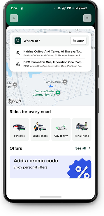
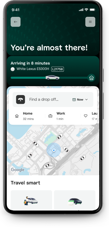
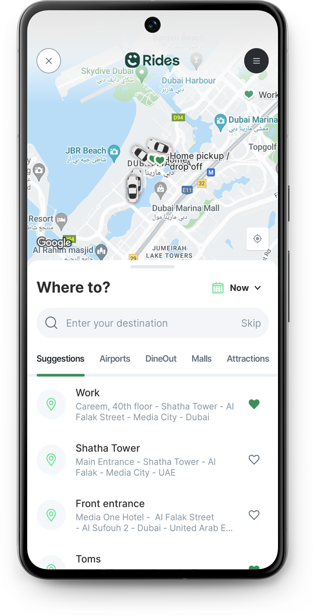
Rides screen before the redesign
After
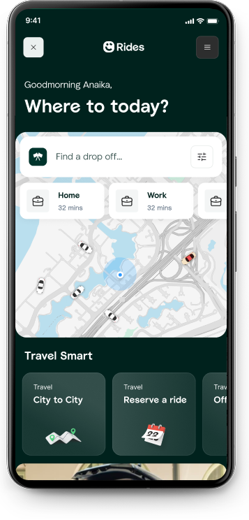
Rides screen after the redesign

One month after launch

10

Markets
launched

12%

Increase in
rides completion

23%

Fewer driver
related cancellations

70 to 95%

CSAT scores
improved

The problem

A ride isn't A to B. It's a thousand different stories.

Rides carried trust, convenience, stature and security for people in very different moments. On too many of them, the product was failing.

"It's about being a doctor on call, relying on Careem when you need to get to the hospital for an emergency, the relief and trust that your ride could help you save a life."

Voice of the user, research study

The leadership challenge

The organisation was optimising for speed. I had to argue for trust.

Every team was under pressure to ship faster, and copying market leaders' flows and features felt like the safest way to do it. Research showed a different problem: riders and captains were losing trust in the same moments, and each blamed the other for it. Arguing for that diagnosis meant arguing against the organisation's default instinct.

Speed became the default response

Shipping faster was the answer to slipping performance. Every team was under pressure to move quickly and improve metrics.

Copying competitors felt like the safest path

Flows, features and UX were lifted from market leaders. It reduced risk, but carried the wrong assumptions.

Structured ownership across the team

Each designer owned a clear piece of the problem, with weekly reviews, async QA and consistency checks so quality didn't depend on me being in every file.

Negotiated with Uber's global design org

Rides ran on Uber's platform, so every change meant negotiating a relationship I didn't control. I escalated blockers and kept roadmaps aligned across engineering, product and stakeholders.

The strategic shift

15 distinct problem areas. Every issue traced back to the same word: trust.

Customer research surfaced a long list of specific complaints, from cancellations to fares to pickup accuracy. Listed individually they read as unrelated bugs. Grouped, they were symptoms of the same thing: riders and captains no longer trusted the system to work. That's what justified a full reimagining of Rides rather than a feature-by-feature fix list: trust was the highest-level issue sitting above every one of them.

Reliability

No cars available Drivers cancelling Wrong pickup or drop-off by GPS Drivers being late Trouble booking a ride App glitches or errors

Control

High costs Incorrect fare quotes Problems with paying Unhelpful customer support Weak personalisation

Consistency

Driver professionalism Limited communication between riders and captains Inconsistent vehicle standards

Safety

Safety concerns

Rebuilding trust

56 journeys mapped.
250+ hypotheses tested.
142 features redesigned.

I led the programme from research and product strategy through team direction, interaction design, stakeholder alignment and rollout.

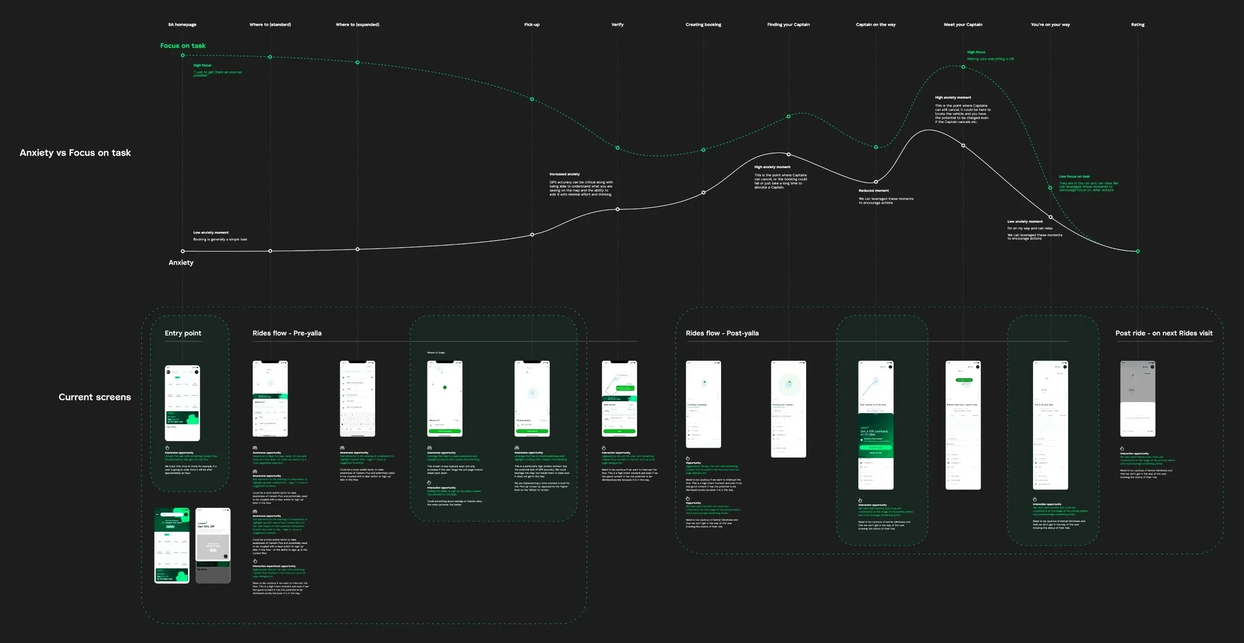
Anxiety versus task focus mapped across the full ride journey
Research sessions across markets, mapping where trust broke on both sides.
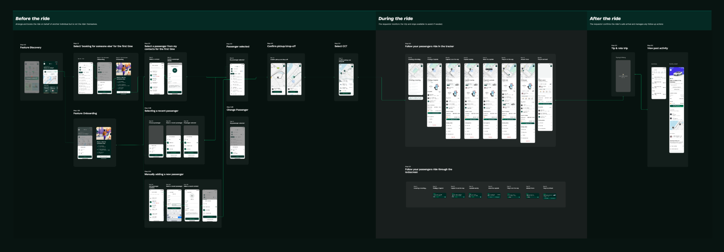
End to end flow for booking a ride on behalf of someone else, split into before, during and after the ride
Booking for someone else shipped as a full flow, not an edge case: tracking, sharing ride status and transporting larger groups, mapped before, during and after the ride.
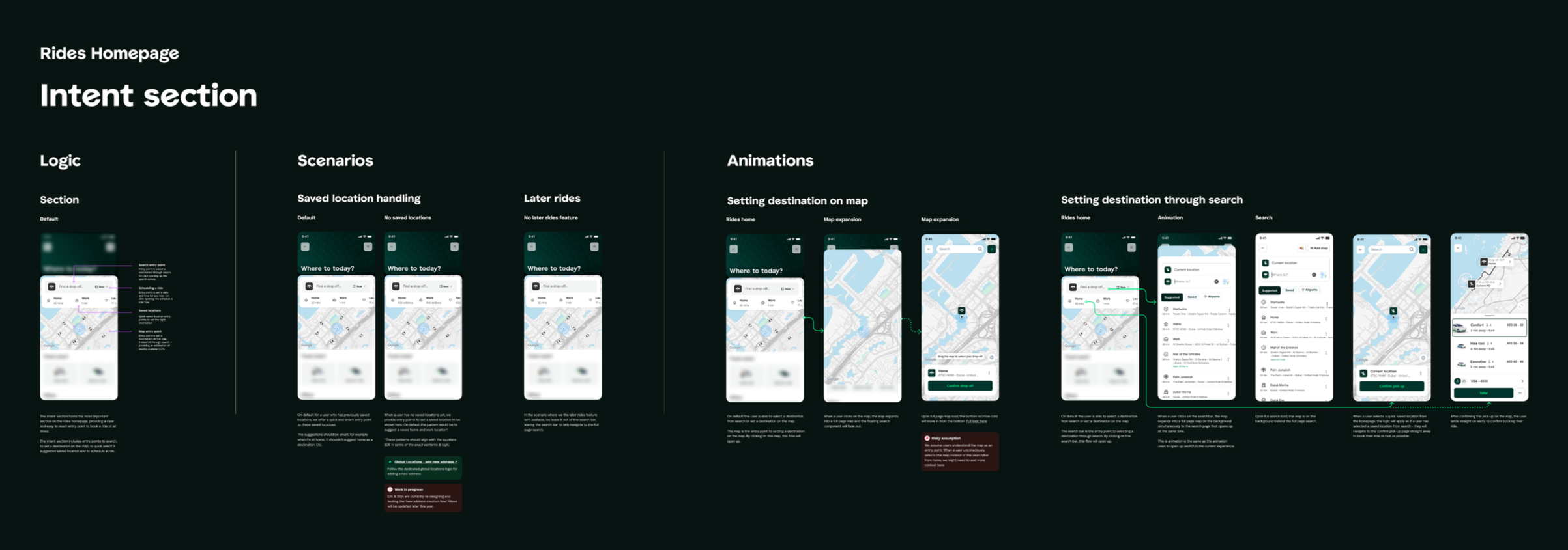
Rides homepage intent section showing logic, scenarios and animation states
Intent logic, scenarios and animation states for the Rides homepage.
"Luke kept the team steady under pressure while shaping strategies that drove impact. He had a clear sense of priorities, helped us maintain balance and shielded us when stakeholder demands became unpredictable."

Valentina Pozzebon - Lead Product Designer, Careem

How the product changed

Rebuilding trust meant
changing the whole journey,
not one screen.

We listened to the research. The goal was no longer to copy competitor features, it was to rebuild trust in the system, at the scale the problem demanded.

Between design, pricing and operations, every issue raised got addressed. What follows are six of the highest-impact changes I led directly, alongside the wider work that closed out the rest.

Reliability and control

01

Better pickup accuracy ended a blame cycle neither side could win.

Problem. Poor GPS accuracy and unclear pickup points left riders and captains acting on different information. When pickups failed, each side blamed the other.

Decision. I led the redesign of pickup around clearer venue guidance, walking directions and more precise captain zones. We also improved the information captains received before accepting a trip, reducing the need to guess what the rider meant.

Impact. Driver-related cancellations fell by 23%, pickups became faster and captains could position themselves more effectively.
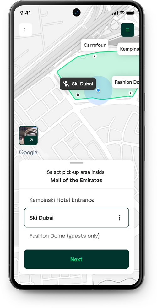
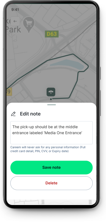
Pick-up location selection inside a mall Walking directions to the confirmed pick-up point

Addressed 5 of the issues raised in research
02

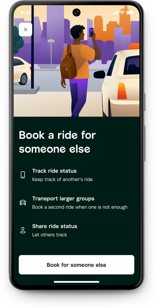
Riders could see more, control more and be surprised less.

Problem. Research repeatedly exposed the same concerns: weak communication, limited trip visibility and too little control when something felt wrong.

Decision. We introduced 72 additional safety capabilities, clearer profiles, booking for others and one place to view and manage trips across the super app.

Impact. Safety moved from a generic promise to visible product behaviour, directly addressing two of the issues riders raised most often.

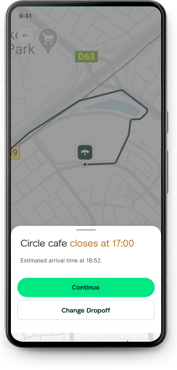
Booking a ride for someone else Drop-off warning showing a venue's opening hours before confirming a stop

Addressed 2 of the issues raised in research
Intelligence and adaptation

03

The first AI model got personalisation wrong. That made the rebuild better.

Problem. The first version predicted destinations without asking. Users trusted saved places more than opaque suggestions, and some recommendations made them feel watched.

Decision. I led the rebuild around context, control and correction. Suggestions became visible, optional and explainable, while repeat behaviour informed pricing, routes and more relevant offers.

Impact. The model became a reusable pattern across Careem, reduced complaints around repeat journeys and replaced blanket promotions with offers shaped around how people actually travelled.

Early AI-driven recommendation prototype: predicted destinations before a rider searched Early AI-driven recommendation prototype: personalised homepage suggestions

Addressed 3 of the issues raised in research
04

Recognising a repeat rider turned seven steps into two.

Problem. Every rider followed the same booking flow, whether they were new or making the same commute twice a day. Repetition created unnecessary steps, errors and inconsistent quotes.

Decision. We redesigned booking as an adaptive journey shaped by behaviour, saved routes and payment preferences. Familiar journeys could be completed in as few as two steps, and the same logic expanded beyond Rides, so booking a restaurant could prompt "do you need a ride?" and vice versa.

Impact. The shorter flow reduced friction and errors, improved fare predictability, and became a reusable pattern other services across the super app built on.

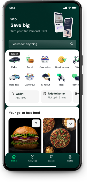
Super-app homepage surfacing cross-service recommendations, including ride prompts from other services

Addressed 4 of the issues raised in research

Platform and complexity

05

Seven services became one experience built around how people actually move.

Problem. Careem's mobility services were organised around the company structure, forcing riders to choose a service before they could solve their actual need.

Decision. I led the move to one consolidated mobility experience, organised around rider intent rather than separate mini-apps and personalised to how each rider actually used it. Traffic, nearby options, customer support and safety features all became part of one coherent journey instead of scattered across separate apps.

Impact. The change removed seven duplicated entry flows, cut unnecessary interaction by more than 70%, and was estimated to reduce implementation cost by 40%. Consolidating the flows also meant fewer glitches and an easier route to support when something went wrong.

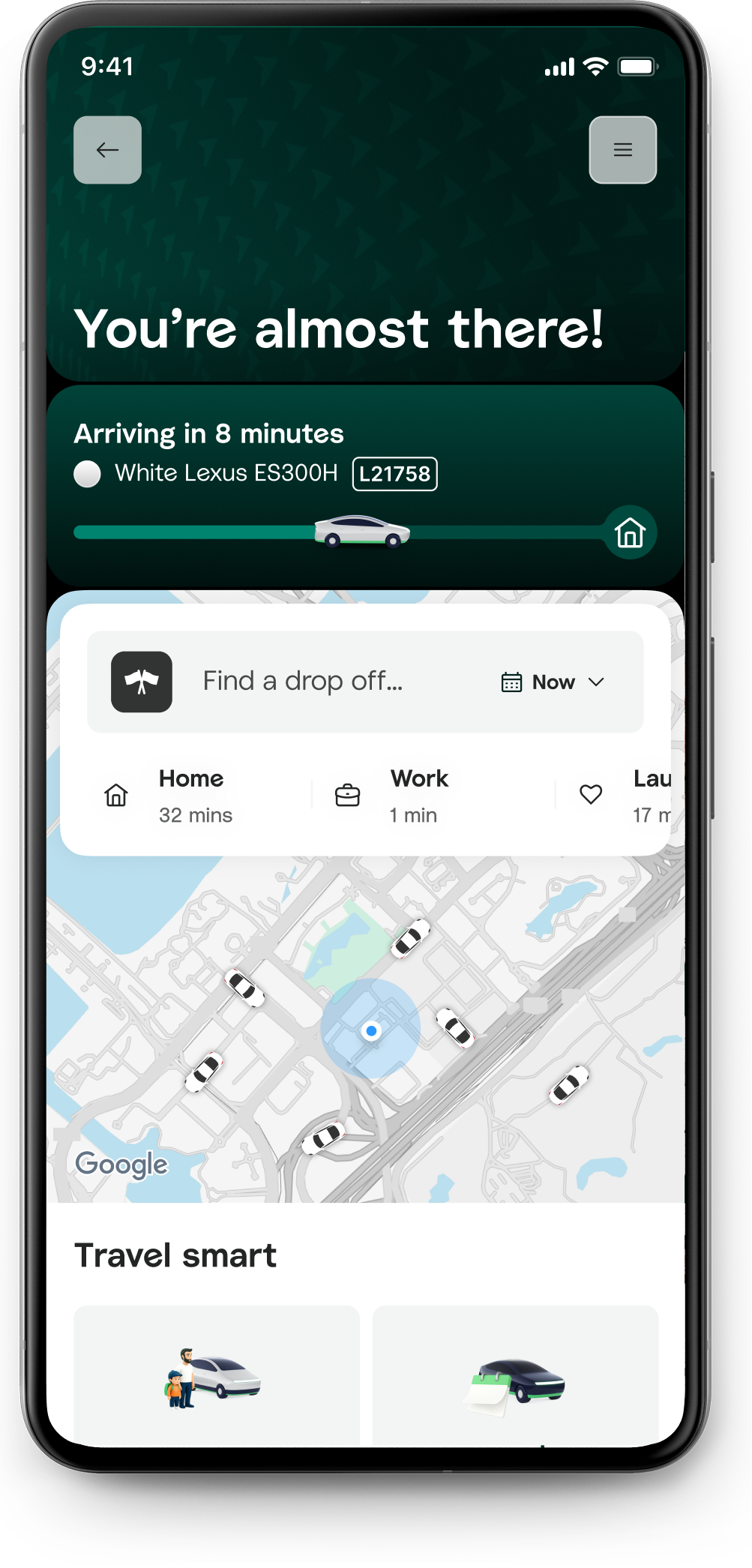
Consolidated Rides homepage with a single destination search entry point

Addressed 6 of the issues raised in research

06

Careem's most requested gap became one coherent journey.

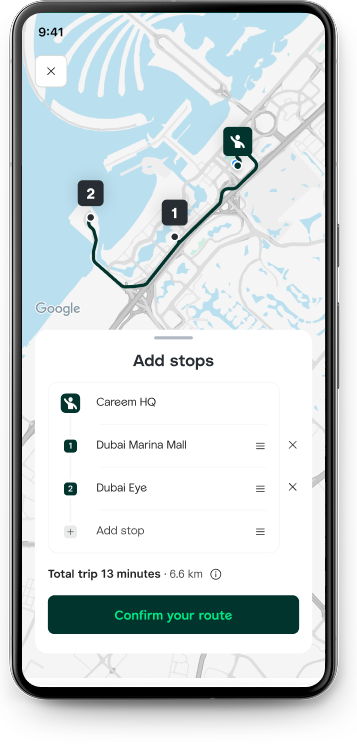
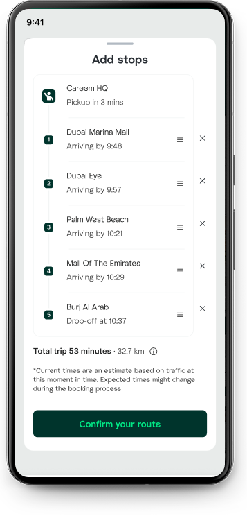
Problem. Riders could not add or reorder stops during a trip. Multiple destinations meant separate bookings, separate fares and more opportunities for cancellation.

Decision. We introduced multi-stop planning with search, reordering and opening-hour information, allowing the full journey to be managed and priced as one trip.

Impact. Adoption outpaced most other changes in the redesign. Riders gained one fare, fewer pickups and a journey that better reflected how they actually moved through the day.

Multi-stop route with added stops on the map Adding stops to a planned journey with arrival times

Addressed 6 of the issues raised in research

Beyond rides

What started as one prediction became a pattern the whole super-app now runs on.

Predictive actions started as a Rides-only idea: surface the next likely trip before a rider had to ask. Once it proved out, the same thinking moved into Food, then got formalised into a shared pattern rather than left as two separate one-off builds.

That formalised version is what shipped on the super-app homepage: not a Rides feature reused elsewhere, but a system built once, specified properly, and adopted by other teams as the default rather than something they had to reinvent from scratch.

Two years, ten markets, one rebuilt system

56

Journeys
mapped

250+

Hypotheses
tested

142

Features
redesigned

10

Markets
launched

What this taught me

Rides are not transactions. They are moments where trust either holds or breaks.

The most important decision happened before a single screen was designed. It was understanding what the problem actually was.

When organisations fall behind, the instinct is to copy what works elsewhere - but a competitor's solution carries a competitor's assumptions. The harder thing is holding the line long enough to find out what's actually broken.

People move through routines, not routes. The more Rides understood timing and behaviour, not just origin and destination, the less it felt like a utility and the more it felt like intelligence. That's the shift that mattered most: not multi-service, multi-intent.

If growth is slowing and the instinct is to copy competitors, it's worth checking if the problem is actually different.